Digital accessibility - create
Create new accessible documents and resources
There are some features common to many digital authoring tools for structuring your content.

Headings
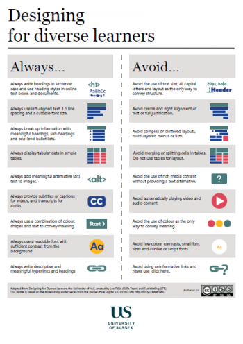
Structure your documents using headings. There are six levels of heading which are used in a hierarchy. The top-level is Heading 1, you might use this for your document heading. Use Heading 2 for subheadings under the main document heading. For further sub-headings under Heading 2, use Heading 3, and so on.

Lists
Use lists where appropriate. Where you are referring to a number of connected items, one after the other, use a list.
If the order of content is important, such as when giving step-by-step instructions, use a numbered (ordered) list. When the order does not matter use a bulleted (unordered) list.

Tables
Use tables for displaying tabular data, not for layout. Keep table structures simple.
Column and row headers should be used where appropriate to distinguish the titles for each column/row from the content.
Web platforms such as Canvas provide opportunities to use a rich variety of media, which can greatly enhance the content in your module. It is therefore important for you to consider users who may not be able to access the media in its native form.

Alt text for images
Provide alternative text (alt text) for images. Alt text allows you to provide a text description for students with visual impairments using screen readers and others unable to view images directly. Alternative text should ideally be limited to 125 characters in length, though they can be longer. Avoid starting alt text with "An image of...". The alternative text should include the key meaning you wanted to convey through the image.
Images are good for visual flow and may not always need a description and can be set as decorative, but we’d encourage you to think twice about including too many non-essential images.

Subtitles for video and transcripts for audio
Videos should include subtitles where possible. Separate subtitles, which can be switched on and off (such as the Panopto subtitles), are preferred to subtitles included in the video file. There are some services that will provide automatic captioning as well as tools to add your own or edit existing subtitles.
Please note that closed captioning is now a requirement as part of the Public Sector Bodies (Website and Mobile Applications) Accessibility Regulations. This came into force in September 2020. For accessibility reasons, Sussex have enabled Panopto to create automatic captions that will be embedded directly onto your video recording.
If you are linking to or using Podcasts or video content, is a transcript available for users of screen readers? Most podcasts do not provide transcriptions, so do bear this in mind.
To get transcripts of conversations there are tools such as Otter.AI and Just Press Record that will auto-transcribe, with varying results, you will need to sense check and edit accordingly. For more professional and more accurate transcription, there are many paid services online.

Use colour in combination with graphics and text to convey meaning
Ensure colour is not the only means of conveying information. Use text, graphics and/or textures in conjunction with colour to ensure your materials are accessible to the widest audience.

Good Contrast
Use a good contrast between background and foreground colours, particularly for text in relation to a background colour. Some lower contrast ratios can still be used provided text is a sufficient size. Too high a contrast can also be an issue for students with dyslexia. A dark colour on a light background may be preferable to black on white. Some software has built-in tools to help you choose accessible colour combinations. Here is a list of colour combinations within the University of Sussex palette which meet the required legal standard. Alternatively, you could use a colour contrast checker.

Text links and headings
When you link to a website or another document, use text which describes the target of the link for the link text. Screen readers read out the text in a link to tell the user where the link goes.
Example: For a contact link, use a meaningful term like "Contact us". Avoid linking words like "Click here" or "read more".
Ensure headings are meaningful. Screen reader software used by visually impaired students reads out the text in a heading and enables users to skip to the next heading if it is not what they are looking for.

 This work is licensed under a Creative Commons Attribution 4.0 International License.
Icons by Font Awesome are licensed under CC-BY 4.0.
Accessibility Icons based on Accessibility Posters by the Home Office are licensed under CC-BY-NC-SA 4.0.

